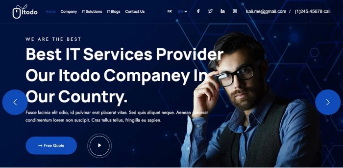
Website Design Ideas, a key element in creating compelling websites, offer a plethora of innovative concepts to elevate your online presence and captivate visitors with unique design elements. From color schemes to typography, navigation to imagery, and mobile optimization to inclusive design, this guide explores the essential components for crafting visually stunning and user-friendly websites.
Introduction to Website Design Ideas
Website design ideas refer to the creative concepts and visual elements used to enhance the look and feel of a website. These ideas encompass the layout, color scheme, typography, images, and overall design aesthetic that contribute to the user experience.
Having innovative design ideas for a website is crucial in today’s digital landscape. A well-designed website not only attracts visitors but also keeps them engaged and encourages them to explore further. Unique design ideas can help a website stand out from the competition, leaving a lasting impression on users and increasing the chances of conversion.
Importance of Unique Design Ideas
- Unique design ideas can create a memorable brand identity for a website, making it easily recognizable among users.
- Innovative design elements can improve user engagement and interaction, leading to increased time spent on the website.
- A visually appealing website with unique design ideas can help build credibility and trust with visitors, ultimately boosting conversion rates.
- Standout design ideas can set a website apart from competitors, showcasing creativity and originality in a crowded online space.
Color Schemes and Themes
Color schemes play a crucial role in website design as they can evoke certain emotions, create visual interest, and enhance user experience. Choosing the right color scheme is essential to convey the right message to the target audience and align with the website’s purpose.
Impact of Color Schemes on Website Design
Color schemes can influence how visitors perceive a website, affecting their mood, behavior, and overall experience. For example, warm colors like red and orange can create a sense of urgency or excitement, while cool colors like blue and green can evoke calmness and trust.
Popular Color Schemes and Themes
- Monochromatic: Uses variations of a single color for a clean and sophisticated look.
- Analogous: Combines colors that are adjacent to each other on the color wheel for a harmonious feel.
- Complementary: Utilizes colors that are opposite each other on the color wheel for a dynamic and vibrant contrast.
Choosing the Right Color Scheme
When selecting a color scheme for a website, consider the brand identity, target audience preferences, and the desired emotional response. It’s important to ensure that the colors are visually appealing, accessible to all users, and consistent throughout the website to maintain a cohesive look and feel.
Typography and Fonts

Typography plays a crucial role in website design as it affects the readability, user experience, and overall aesthetic appeal of a site. Selecting the right fonts can make a significant difference in how your content is perceived by visitors. Font pairing and consistency are essential for creating a cohesive look that enhances the design of your website.
Selecting Fonts for Website Design
When choosing fonts for your website, consider the following tips to enhance the overall design:
- Choose fonts that align with your brand’s personality and message.
- Avoid using too many different fonts – stick to 2-3 fonts for a clean and professional look.
- Ensure that the fonts you select are easy to read on all devices, including mobile.
- Consider the hierarchy of text on your website and use different font weights and styles to differentiate between headings, subheadings, and body text.
- Test different font pairings to find combinations that complement each other and create visual interest.
Importance of Font Pairing and Consistency
Font pairing involves selecting two or more fonts that work well together to create a harmonious design. Consistency in font usage throughout your website helps establish a visual identity and reinforces brand recognition. Here are some reasons why font pairing and consistency are crucial:
- Creates a cohesive and polished look that enhances the overall design aesthetic.
- Makes your website more visually appealing and easier to navigate for users.
- Builds brand recognition and reinforces your brand’s identity through consistent use of fonts.
- Improves readability and user experience by maintaining a clear hierarchy of text.
- Establishes a sense of professionalism and attention to detail in your website design.
Navigation and User Experience: Website Design Ideas
When it comes to website design, intuitive navigation plays a crucial role in providing an optimal user experience. A well-designed navigation menu can help users easily find the information they are looking for, leading to increased engagement and satisfaction.
Importance of Intuitive Navigation
- Allows users to quickly and effortlessly navigate through the website.
- Helps users understand the website’s structure and find relevant content.
- Improves accessibility for users with disabilities by providing clear pathways.
- Enhances overall user experience and encourages repeat visits.
Best Practices for User-Friendly Navigation Menu
- Keep it simple and clear, with easy-to-understand labels for each menu item.
- Organize menu items logically, based on user needs and website structure.
- Include a search function for users to quickly locate specific content.
- Utilize dropdown menus for subcategories to avoid cluttering the main menu.
- Ensure the navigation menu is responsive and works well on different devices.
Creative Navigation Designs for Improved User Experience, Website Design Ideas
- Hidden navigation menus that appear when users hover over or click a specific area.
- Sticky navigation bars that remain visible as users scroll down the page.
- Mega menus with multiple columns and images for a visually appealing experience.
- Interactive navigation elements such as animated icons or hover effects.
Imagery and Visual Elements
When it comes to website design, high-quality images and visual elements play a crucial role in capturing the attention of visitors and conveying the brand’s message effectively. The use of compelling imagery can create a strong visual impact and enhance the overall user experience.
Choosing the Right Images
Selecting images that resonate with the brand and message is essential for creating a cohesive and engaging website. It’s important to choose high-quality, relevant images that align with the brand’s values and aesthetics. Images should be visually appealing, well-composed, and contribute to the overall design of the website.
- Consider the tone and style of the brand when choosing images.
- Avoid using generic stock photos and opt for original or customized imagery.
- Ensure that the images are of high resolution to maintain quality on different devices.
- Use images that evoke emotions or tell a story to connect with the audience.
Multimedia Elements
In addition to static images, multimedia elements such as videos and animations can be used to enhance the website’s appeal and engage visitors. Videos can provide dynamic content and showcase products or services in action, while animations can add a touch of interactivity and visual interest.
- Integrate videos that are relevant and informative, keeping them concise and engaging.
- Create animations that are subtle and enhance the user experience without being distracting.
- Ensure multimedia elements are optimized for fast loading times to prevent delays.
- Use multimedia strategically to complement the overall design and messaging of the website.
Responsive Design and Mobile Optimization

Responsive design is essential for websites as it allows them to adapt and provide an optimal viewing experience across a wide range of devices, from desktop computers to smartphones and tablets. This ensures that users can easily access and navigate the website regardless of the device they are using.
Importance of Responsive Design
- Improved user experience: Responsive design ensures that the website is easy to use and navigate on any device, leading to higher user satisfaction.
- benefits: Google prioritizes mobile-friendly websites in search results, making responsive design crucial for improving search engine rankings.
- Increased reach: With the growing number of mobile users, having a responsive website allows you to reach a wider audience.
Mobile Optimization Techniques
- Optimize images and videos: Compressing images and videos can help improve loading times on mobile devices.
- Use a responsive layout: Design the website to adjust to different screen sizes and resolutions for a seamless user experience.
- Minimize text and use clear fonts: Mobile screens have limited space, so it’s important to keep content concise and easy to read.
Testing Tools for Responsive Design
- Google Mobile-Friendly Test: This tool analyzes a website’s mobile-friendliness and provides suggestions for improvement.
- Browser Developer Tools: Most browsers offer developer tools that allow you to simulate how a website looks on different devices.
- Responsive Design Checker: This tool lets you see how a website appears on various screen sizes, helping you identify any design issues.
Call-to-Action (CTA) Placement
When it comes to website design, strategically placing Call-to-Action (CTA) buttons is crucial for guiding users towards taking specific actions. CTAs serve as signposts that direct visitors on what steps to take next, ultimately leading to conversions or achieving the website’s goals.
Importance of Strategically Placing CTAs
- CTAs help in increasing user engagement by prompting visitors to interact with the website.
- Well-placed CTAs can guide users through the desired flow of the website, enhancing their overall experience.
- Strategically positioning CTAs at key points on the page can significantly impact conversion rates.
Examples of Effective CTA Placements
- Placing a CTA button at the end of a product description can encourage users to make a purchase.
- Having a sticky CTA that remains visible as users scroll can ensure constant visibility and prompt action.
- Including CTAs within blog posts can lead readers to related content or encourage them to subscribe to newsletters.
Designing CTAs for Maximum Impact
- Use contrasting colors for CTAs to make them stand out and attract attention.
- Keep the CTA copy concise, clear, and action-oriented to compel users to click.
- Ensure CTAs are placed where users naturally expect to find them, such as at the end of a form or after a product showcase.
Accessibility and Inclusivity
When it comes to website design, it’s crucial to make sure that everyone can access and use your site, regardless of any disabilities they may have. Designing websites that are accessible to all users is not only the right thing to do, but it also helps you reach a wider audience and improve user experience.
Importance of Accessibility
Creating an inclusive website design is important because it ensures that people with disabilities can navigate your site easily and access the information they need. It also helps improve and overall usability for all users. Here are some best practices to keep in mind:
- Provide alt text for images to assist visually impaired users.
- Use descriptive link text to improve screen reader navigation.
- Ensure your website is keyboard accessible for users who cannot use a mouse.
- Implement proper heading structures for easy navigation and screen reader compatibility.
Optimizing Accessibility for Users with Disabilities
Optimizing website accessibility for users with disabilities involves considering factors like color contrast, text size, and navigation options. Here are some tips to make your site more inclusive:
- Choose color schemes with sufficient contrast for readability.
- Allow users to adjust text size for better visibility.
- Provide clear and consistent navigation menus.
- Include video captions and transcripts for hearing-impaired users.

