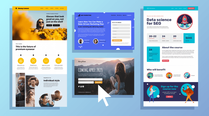
Effective Landing Pages are the key to online success. Dive into the world of captivating design and compelling content that drives conversions.
From essential elements to design best practices, discover how to create landing pages that leave a lasting impact on your audience.
What are Effective Landing Pages?

Effective landing pages are specific web pages designed to capture a visitor’s attention and encourage them to take a certain action, such as making a purchase, signing up for a newsletter, or downloading a resource. These pages are crucial for online businesses as they serve as the first point of contact between the visitor and the business, often determining whether the visitor will convert into a customer or not.
Importance of Effective Landing Pages
- Clear Call-to-Action: Successful landing pages have a clear and compelling call-to-action that guides visitors on what to do next.
- Relevant Content: Effective landing pages provide relevant and valuable information that resonates with the target audience.
- Minimal Distractions: A good landing page eliminates distractions and focuses on the main goal, increasing the chances of conversion.
- Mobile Optimization: With the rise of mobile usage, landing pages need to be optimized for mobile devices to ensure a seamless user experience.
Examples of Successful Landing Pages
- Airbnb: Airbnb’s landing page is simple, visually appealing, and focuses on encouraging visitors to search for accommodations in their desired location.
- Squarespace: Squarespace’s landing page showcases stunning website templates, a clear call-to-action to start a free trial, and customer testimonials to build trust.
- HubSpot: HubSpot’s landing page offers a free tool or resource in exchange for contact information, effectively generating leads for their business.
Elements of Effective Landing Pages
Creating a successful landing page requires a combination of essential elements that work together to capture the visitor’s attention and encourage them to take action.
Compelling Headlines and Clear Call-to-Action Buttons
Effective landing pages start with a compelling headline that grabs the visitor’s attention and clearly communicates the value proposition of the offer. A strong headline should be concise, relevant, and persuasive, drawing the visitor in to learn more about the product or service. Additionally, clear call-to-action buttons are crucial for guiding the visitor towards the desired action, whether it’s making a purchase, signing up for a newsletter, or downloading a resource. These buttons should be prominently displayed, visually appealing, and use action-oriented language to prompt the visitor to take the next step.
Visual Elements: Images, Videos, and Graphics
Visual elements play a significant role in creating engaging landing pages. High-quality images can help to showcase the product or service, evoke emotions, and establish credibility. Videos are also effective in capturing the visitor’s attention and providing a more interactive experience. Including graphics such as icons, charts, or infographics can help to break up the text, highlight key information, and make the landing page more visually appealing. When used strategically, visual elements can enhance the overall design and user experience, making the landing page more memorable and impactful.
Design Best Practices for Landing Pages: Effective Landing Pages

When it comes to designing landing pages, you gotta keep it fresh, fly, and user-friendly. A killer design can make or break that conversion rate, ya dig?
Visually Appealing and User-Friendly Design
First things first, make sure your landing page is visually appealing. Use eye-catching colors, high-quality images, and clean layouts that keep the visitor engaged. Keep it simple, but make sure it pops!
- Use whitespace to keep things clean and organized.
- Choose fonts that are easy to read and complement your brand.
- Incorporate clear call-to-action buttons that stand out and guide the user.
Importance of Mobile Responsiveness
In this day and age, everyone and their mama is browsing on their phones. Make sure your landing page is mobile-responsive, so it looks tight on all devices.
- Optimize images and videos for mobile viewing.
- Keep forms short and sweet for easy completion on small screens.
- Test your landing page on different devices to ensure a smooth experience for all users.
Impact of Loading Speed, Effective Landing Pages
Ain’t nobody got time to wait around for a slow-loading page. Loading speed can make or break that bounce rate, so keep it snappy!
- Optimize images and videos to reduce load times.
- Minimize the use of large files that can slow down your page.
- Consider using a content delivery network (CDN) to speed up load times for users across different locations.
Call-to-Action Optimization
Creating a compelling call-to-action (CTA) button is crucial for driving conversions on your landing page. The design, placement, and messaging of your CTA can significantly impact the overall success of your campaign.
When designing your CTA button, make sure to use contrasting colors that stand out on the page. The button should be large enough to catch the visitor’s eye but not too overpowering. Use clear and concise language that tells the visitor exactly what action you want them to take, whether it’s “Sign Up Now” or “Get Started.”
Placement of the CTA is also key. It should be prominently displayed above the fold so that visitors don’t have to scroll to find it. Consider placing the CTA button in multiple locations on the page, such as at the top and bottom, to increase visibility.
A/B testing your CTAs is essential for optimizing conversion rates. Try different colors, text variations, and placements to see which ones resonate best with your audience. Analyze the data to determine which CTA performs the best and make adjustments accordingly.
Strategies for A/B Testing CTAs
- Change the color of the CTA button to see if it affects click-through rates.
- Experiment with different wording on the button to determine what message resonates best with your audience.
- Try placing the CTA in different locations on the page to see where it gets the most attention.
- Test the size and shape of the button to see if it influences conversions.

